The Year of Fun!!

January 01, 2013New Year’s, to me, is always a time to cleanse the palette, wipe the slate clean, start anew. A few moments of reflection of years’ past is typically followed by a resolve (like millions of other repentants) to 1.eat better 2.exercise more, blah, blah, blah. Well, this year is different! I am personally declaring 2013 to be The Year of Fun!! If there is an opportunity to learn, create, travel, design, teach, cook, dine, soar,Alaskan Bi-Plane on Country Design Home

entertain or be entertained, count me in! Time for a fresh start and a new perspective, time for some fun! (disclaimer: this does not include any activities where I am strapped to a harness and soaring above the clouds- I do like to keep my feet firmly planted on our planet. Oh, and also, not kayaking, not a huge fan, although a little water rafting in Alaska might fit the bill nicely : )    Alaska Water Rafting

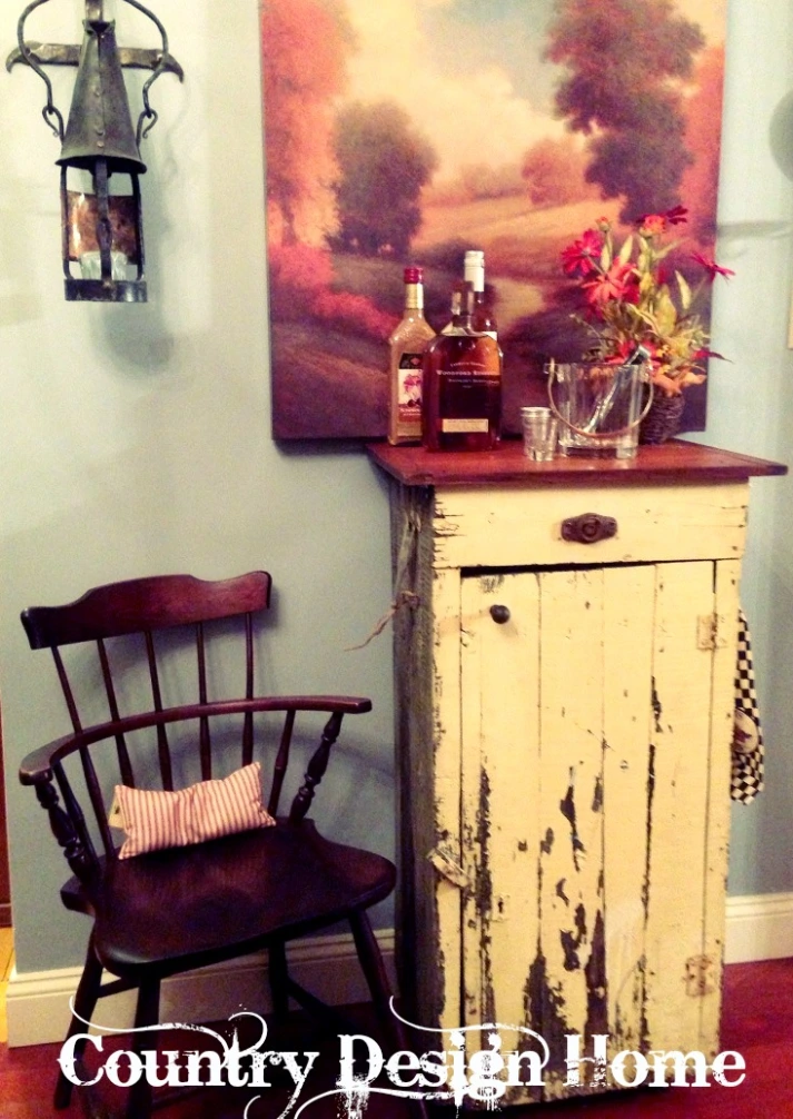
And so it begins by clearing out the dining room cupboard. Out went all of the colorful Christmas holiday plates and decorations.

Christmas Dishes in Hutch     Snowman PlatterNikko Christmas Dishes

In their place? White. Loads of white. Cupboard with white pottery

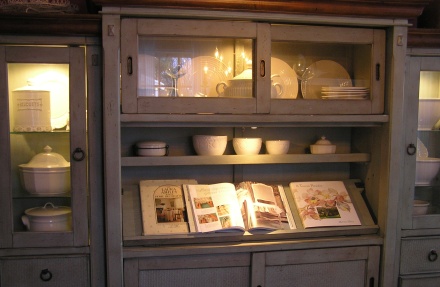
Plates, stacks of bowls, crocks and tureens-all white-that I have collected over the years.

Cupboard with white bowls

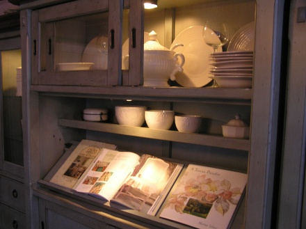
The color white makes everything clearer, cleaner and purer. White becomes the perfect backdrop for the millions of other beautiful colors in our spectrum and makes them pop. There are so many shades of white, so you can mix and match them to create a fabulously layered look.

White can be classically elegant:

or elegantly classic

White mirrored armoire

Photo via My Shabby Streamside Studio

White can be whimsical

Photo via Better Homes and Gardens

fanciful

White flower paper installation

Photo via ComeUpToMyRoom.com

funky & fun

white vintage vignette

Photo via Biskops Garden Blogspot

tastefully simple

White mirrored vanity

Photo via Citified.blogspot.com

or simply extraordinary

White room from Capri Palace Hotel, Anacapri - Italy

Photo via Fabrizia Frezza Architecture Interiors

So if you are looking for a way to start fresh and new for 2013, forget those resolutions that only last a day or two and get your exercise by grabbing a can of white paint and giving your space a whole new look!! Happy Fun Year everyone!!! Susan 

The Glidden Project-Complete!

Soooo, how did I do?!? If you remember the before pics, dark and dreary, not much light, kind of drab. But now… bright and cheerful, lighter and fresher-just in time for the holidays!! A few things I did for this makeover:

1. Repainted all the walls, including the tired blue fireplace wall, which immediately brightened up the entire room.

Completed Room

2. Transformed the bookcases/media wall. Fresh paint on back wall, repainted all the shelving from dark, stained brown to creamy white. I also painted the niche with the Steel Blue for a focal point- where the hand-carved whale now sits. Backlighting it with some LED lights gives an aquarium-like transformation-kind of cool, right?

Glidden Bookcase Whale Wall

3. Edited the shelves by removing most of Coach’s old books and keeping the ones that have some meaning (or the colors looked pretty : )

Bookshelves Edited

4. Had this old chair and ottoman re-upholstered in a light blue linen with creamy white trim.

Family Room Chair Before

Here is the brighter, fresher, newly transformed chair and ottoman! I have a great company in Lynn, just in case anyone needs a remodel…

Glidden Chair Redo

4. We kept the rugs the same, but change out some lampshades, added some colorful throw pillows, some soft fluffy blankets for those chilly winter evenings and re-arranged the pictures and mirrors.  This is Daisy’s chair. She would be really upset if we got rid of her chair, even if she really isn’t able to get up there to curl into a ball : )

Daisy's Chair

Wall Completed with Sofa

5. I also used the Steel Blue to re-paint the arched mirror so it would stand out against the Antique Beige background.

Arched Mirror Steel Blue

And then I decorated for the holidays, of course!

Decorated Fireplace and Tree

Arched Mirror Steel Blue Decorated

I would like to again thank the folks at Glidden for their paint, and their patience in allowing me the time to make this happen and write about it in my own words. I hope this story inspires you to try something new, break away from the known and do a little experimenting of your own!  Susan

The Glidden Project

Glidden Autumn Paint ChipBack in October, I spied this insert from Glidden Paints inside the Halloween issue of Country Living Magazine The brilliant autumn-inspired colors in the ad caught my eye, as did their interactive Country Living October 2012website, so I blogged about it. Well, the good people at Glidden saw my blog (yay!) and asked if I would be interested in doing a room makeover using their paint brand. They would send me the paints of my choice, I would paint it myself and then write about the experience. Now, those of you who read my blog know that I am a one-paint kind of decorista. Over the years I have tried just about every paint brand, only to keep returning to my personal favorite. But, since I had been contemplating a facelift for our family room anyway, it seemed like the perfect time to sieze an amazing opportunity to try something new and write a blog for the whole world to see (well, maybe not the whole world, but at least my blogging world).

Here’s the story: The last time we re-painted the family room, I had decided to add an accent color to the fireplace wall.

Glidden Before Mantel

At the time, it worked to enhance the fireplace and mantel that were viewable from the kitchen, which was the same color. However, last fall we converted our adjacent deck to a screened-in porch, which we LOVE, but any natural light we had streaming into the picture window wasGlidden porch

greatly diminished, making the room darker and less appealing. Along with that, I had changed the sofa slipcover from this light toile print

Glidden Blue Toile

to a brick red solid, creating a cavernous feel.

Glidden Brick Red Sofa

 Of course, that was not my intent. The original blue slipcover that came with the sofa we bought back in 2005 was too flowery for this more “countrified” space, and the red slipcover I purchased online looked a lot brighter on my computer screen than in person. Bright, cheerful color is my thing…dark and gloomy, not so much. And several of the decorating elements in the room- like this hand-carved whale-also creamy white, just faded into the walls, which were the same color as the trim. Glidden Whale

Time for a change. The new colors I chose were Antique Beige Glidden Antique Beige

for the walls, because I needed a color just a shade or two darker than the trim but still bright and light, and this one has just a hint of pink, and Steel Blue for the accents to match the rugs and curtains that I was planning to keep. Glidden Steel Blue

I kept the trim, fireplace and bookcases the same creamy white semi-gloss. But before I could paint the wall, I had to do a wee bit of patching since I had made some pretty big screw holes while hanging a mirror awhile back.

IMG_5957

A hole this big cannot just be filled with putty, you actually need to use some of this mesh tape to bridge it, and give it something to grab onto.

Mesh Spackling Tape

Patching the Hole

Once the putty was dry and sanded, I used this Glidden Primer called Gripper . (I had given this a High Five For Friday awhile ago-see Primed for Success...)

Glidden Gripper CanIt has a school-glue consistency, covers everything and seals in stains and dark colors, yet it is water-based for easy cleanup.

Blue wall with Gripper Primer

I was able to paint all of these shelves that were stained and polyurethaned over 25 years ago-without even sanding them!

Shelving

IMG_5965

Amazing stuff.  Next up was two coats of the eggshell finish Antique Beige Glidden. Having stated above that I have been using the same paint brand for years, I have to tell you that I was very happily surprised by how great this paint is! I typically judge my paint by the several factors listed below; in each case, the Glidden paint passed with flying colors!

1.Drippiness: Minimal dripping and splattering, both from the brush and the rollers (foam and low nap), even from up high on the ladder.

2.Sagging: No sagging at all (that’s when you roll or brush the paint on, then look back a minute or two later and find that the paint is literally     sagging from the wall, which you then have to go and redo before it sets).

3.Ease of Use: The paint rolled and brushed on smoothly and quickly, covered beautifully, cleaned up easily with soap and water.

4.Overall Depth of Color. The color is deep and even and the eggshell finish has just enough glow so the light from the window is refracted- exactly what I needed to brighten up the room!

Coach walked in after I was done (yup, the interior painting is my thing, he sticks to the outdoors), and said “wow, this looks really amazing!”, which, if you know coach, is a lot for him to say… Sooo, this is the before:

Glidden Blue Wall Before

Bookcases Dark

But you will have to come back tomorrow for the after : ) Happy last minute shopping everyone!!! Susan

Primed for Success

OK, so back to the Hall of Shame Project…we are getting closer. Time to paint the balusters that have been covered with the drippings from the Minwax Antique Refinisher I used a while back to strip the railings. I don’t know about all of you, but I HATE prep work. The stripping, sanding, tack cloth wiping.. and the prospect of prepping all of those white poles was daunting. 

Then I remembered a product that my design instructor had mentioned: Gripper, By Glidden, this week’s High Five for Friday!

It is an interior/exterior primer, sealer, all-purpose stain killer and bonder for walls, woods, masonry, glass and previously painted metals. If you have a surface to prime, they’ve got it covered. And you don’t even have to sand!!! Just so long as it’s clean and dirt/oil free, you are good to go. OK, I am soooo in. Upon opening the can, I discovered that it is essentially odorless (although it does have all of those “harmful if inhaled warnings”), and the consistency of white school glue.

It glides on easily and smoothly, and leaves a nice, even coat. It even covered all of those brown drip marks on the first try!!

This is DIY magic in a can : ) So if any of you are attempting to complete a major renovation in the next week leading up to Thanksgiving (I know, who is dumb enough to do that?!?) then get to your local big box store and grab some Gripper! And while you’re at it, could you find me someone who will install carpeting in time for Turkey Day? TGIF everyone!! Susan

High Five for HomeGoods

So while I was taking photos of our guest bedroom for my blog,  I started looking around and realized that most of the decor in the room was purchased at HomeGoods! It was not intentional, and it was all purchased at different times over the past couple of years since my daughter moved out. Since her childhood bedroom has become my dressing room, I have decorated it with things that make me happy. Pink is my color, and I really can’t use it anywhere else in the house, so I have decorated the room inspired by this happy rug, purchased at HomeGoods.

I have slowly built a palette of black and white toile, with pink and green accents.  This vignette, with the exception of the photo of the extraordinary Jackie O (the frame yes, the photo, no) 

was all purchased at, where else, HomeGoods.

The vanity was a plain jane gray when I purchased it, so I spruced it up with some black and silver paint, and added the mirrored tile top.

The shimmery paisley ceramic garden stool gives me a great place to sit and apply my makeup.

Although the rocker was a vintage piece I painted a yummy watermelon color, the pillow and throw were HG as well.

The iron and brass daybed has been in this very spot for over 25 years, and I really don’t have the heart to paint it, scratches and all.

Everything on the bed was from HG, with the exception of the vintage doll and bear. Now by looking at this, I would image you must be thinking, “well, how often does she go there exactly?!” The perfectly honest truth is, often enough. And remember… which means it’s time for a shopping trip! Susan

That’s A Wrap!

Do you ever have an image in your head of a specific product, and you can’t find anything like it in a store? No? Well I do. Drives me nuts. Don’t know why I just can’t be like everyone else and do things the easy way!  In preparing to wrap a gift for a bridal shower today, I knew I wanted to go with an old-fashioned look for the package. I tried to find wrapping paper that would fit the bill, but nothing even came close to the look I was going for. Since I couldn’t find the right paper, with little time to spare, I decided to create my own.  Quick, cheap and easy. (I’m sure there is a joke in there somewhere…) Grabbed a roll of kraft paper (made from 100% recycled materials-yay!) 


a pre-cut stencil

and some brown acrylic paint.

Rolled out and cut the right amount of paper to cover the gift. Placing the stencil in a repeat pattern all over the paper, I applied the paint with a piece of sponge, with a light touch because I wanted a more faded, aged look.

Once complete, I allowed it to dry- almost instantly- then wrapped the package. For the ribbon I used some jute.

And created the bow with a touch of blue hemp, because the bride-to-be really likes that color combo.

For the tag, I made a little chalkboard sign that she can re-use. (Instructions to follow soon…)

Finished! A gift with my own personal stamp. (Sorry, not a great pic, but you get the idea, right?)

This was a weekend jam-packed with family and friends and loads of fun, with a wedding and a wedding shower on the calendar. Whew! Hope you had a fun weekend too! Monday, Monday… Susan 

Here Comes the Sun(flowers)

Dreary gray sky today, hot and humid-temps in the 90’s-severe thunderstorms,  per  the weatherman. Having my morning coffee on the back porch, looking at the exploding garden that all of a sudden needs some serious pruning and weeding. We have rose bushes, daisies, tiger lilies, phlox in several shades of purples and pinks (thanks to the cross-pollination from the bees : ). One forbidden flower in our garden? The Sunflower, aptly named because of their ability to follow the sun with their giant heads. Now, Coach loves sunflowers, perhaps because they are so big that they give a little extra bang for your buck? Me, not so much. They remind me of that giant man-eating Venus Fly Trap in “The Little Shop of Horrors”. (for those of you unfamiliar with this vintage cult film, click here. When I imagine those ginormous flowers hovering around my back porch, the phrase “what’s eating you” always comes to mind. Do you think there is such a thing as SAD (Sunflower Affected Disorder)? If so, I believe I may be afflicted with that particular malady. ..That being said, I do appreciate that sunflowers, with their bright yellow petals and chocolate brown anther (that’s the middle) can make a colorful impact in a small space. Because of the various shades of yellows and browns and golds, they are comfortable in any color scheme.

Most often used in what I consider to be rustic country decor (with chickens too!)sunflowers in today’s modern eclectic esthetic can add a touch of whimsy

a pop of color in an otherwise black and white and red scheme-LOVE THIS!)They can be bright and cheery or

add a bold contrast (yikes! this shower would slay me-literally!)

Sunflowers can bring a touch of country to a city dwelling

Or create a cozy colorful outdoor nook for reading and relaxing (where they are safely ensconced in that large glass cylinder : )

You might like to know that the color Yellow shines with optimism, enlightenment, happiness and energy and carries the promise of a positive future. Impressionist Vincent Van Gogh thought so, as they were a favorite subject, but most likely that was before he cut off his ear in the throes of depression…

Here’s hoping that this blog about Sunflowers will brighten your day!  Susan

Addendum: Dried Sunflower seeds are also a fun, nutritious treat that can be used in many recipes to add some crunch and flavor. This cold broccoli salad with raisins, bacon and sunflower seeds is a family favorite at any BBQ. DO NOT USE UNSHELLED SEEDS in this recipe! Lesson learned the hard way-literally. Have a sunny Friday!


Tee Shirt Memory Quilt

I am adding a new category to my blog called

D.I.M. (Do It Myself Because If I Don’t Do It Who Else Will?)

So today’s D.I.M project is a T-Shirt Quilt!  I have had a love affair with quilts since I was a kid, especially antique, hand-stitched beauties that have withstood the test of time. (I am a country-girl at heart, after all) Not having much time these days to spend the hours necessary to make an authentic hand-made quilt, I typically create T-shirt quilts and donate them for various Boston area charities through

 Threads of Hope.

Occasionally I am commissioned to make one as a gift, so I am featuring this quilt for a soon-to-be high school grad for demonstration purposes. The collection of t-shirts his mom handed over to me are sacred to him- various basketball & soccer teams, childhood memories of camping and community service- and one very special shirt with pics of his dog.  Each time I create a quilt, I do so with the recipient in mind, creating what I hope will be a cherished momento that will last a lifetime. In that spirit, I am sharing this information so that you, too, can make a quilt for someone you love!

T-Shirt Quilt Creations 101 is now in session.

Supplies you will need to create one quilt approx 52 x 70 inches: A layout of the quilt you are making with the shirts and cross-pieces laid out.

T-shirts -I typically work with a dozen, using each as a square, cut 14″ X 16″. They can be brand new, used, stained, painted, torn-it doesn’t matter, as you will be cutting them apart anyway. Make sure you wash them all before you start- don’t want your quilt smelling like a locker room!

Scissors, Rotary Cutter & Cutting Board, T-square.All the tools you need to get the shirts cut accurately-very important!

Pellon Fusible Interfacing. T-shirts have a lot of give & stretch, so they need to be stabilized to prevent them from warping while sewing. This stuff is the easiest and cheapest to work with. Only .99 per yard, and with a Joann’s coupon, only .50!

Batting- you can use cotton or poly. I prefer the poly because it holds its shape better and is not as heavy as the cotton fill. Again with a coupon, pretty inexpensive.

Fabric for cross pieces and backing. I typically use a sheet- a full-sized one will give you a single piece for the backing, then enough left over to make the columns and rows. I have an embroidery machine, so I use different fabrics for the cross-pieces, but you can use the same for all three. If you want to use different fabrics to add more color or design, these little Fat Quarters are great- each one gives you 5 cross-pieces!

It goes without saying that you need a sewing machine. Any kind, as long as it sews a straight line or if you want to get a bit fancy, zig-zag! Mine is an old Brother that I got at Target for $159.99 Nothing special, but it gets the job done.

OK, now that you have all the stuff, let’s get going! First you need to identify what part of the shirts you would like to use. Sometimes I just use the front panel, other times I take patches off the sleeves or back and applique them to the front for added interest.

Rough-cut the front panels to approx 16W X 18L . Once you have them rough-cut, fuse each piece with the interfacing on the reverse side. When using the iron, make sure you follow the directions for the interfacing! Also, if you are using game shirts or raised silk-screen shirts, do not place the iron directly onto the shirt or it will melt! Always use a top cloth of white cotton. Once you have fused the square, make the final cut to 14W x 16L inches. Using a half-inch seam allowance, your final squares will end up being 13W X 15L.

Now cut all of your side and cross pieces. Cross pieces will be 14W X 4L. (I always leave a little extra on each end, in case of mistakes : ). If you have 3 columns of shirt squares, you will need 4 long strips approximately 80 inches long for in between each one and a top and bottom piece approximately 60W by 4L. I cut mine 4 inches wide, but you could do less, or more, depending on how big you want the quilt to be.

Line up your shirts in the order you wish them to be on the quilt. This usually takes place on the floor, as I don’t have a table big enough for the full visual. Now begin assembling your quilt, starting with top cross-piece, then a shirt square, then another cross piece, then a square, and so on, building your columns 4 shirts down and your rows 3 across. As you add each piece, make sure you line it up with the one below so your columns are even and straight.

Once you have your three columns of squares and cross-pieces, stitch the columns of 4 inch wide fabric that will hold the entire top of the quilt together. Add the top and bottom pieces that create a “frame” around the squares. Keep checking to make sure that your corners all match up! You know that old carpenter’s saying “Measure twice, cut once?”, so important! I measure and re-measure as I go. Trim excess.

Now that your top is completed, you will attach it to the back, right sides together. Pin first, then stitch, then trim. Make sure you leave an adequate opening to turn the quilt right side out, at least one full shirt square in width.  Once it is trimmed, you are going to hand baste the batting to the quilt all the way around. Again, the easiest way I have found to do this is on the floor (not great for the back…)

Once the batting is basted on, trim the excess away.

Turn your quilt right side out. Press and pin the edges and corners.

I stitch each corner with a tiny machine zig-zag, to hold the quilt and batting in place through all three layers. Press closed the opening and stitch by hand, or with a decorative stitch (I used a blanket stitch here).  Press again, trim away any threads and you’re done!

A work of art that you can proudly present as a gift for that special someone. Now, I know this is somewhat confusing, and trust me, you won’t do this in a day. If you have any questions, or need assistance, please email me @ countrydesignhome@gmail.com.

Just remember, “a stitch in time saves nine” (right, I have no idea what that means either) Susan

Mirror, Mirror on the Wall…

…I found a mirror for my new front hall!!! With the Hall of Shame project still ongoing, I have been searching for artwork, occasional tables and other assorted items to fill the space once it is completed. (and, yes, it is still a work in progress- but good things come to those who wait, right?) Along with my usual trips to HomeGoods and the various local antique and junque shops I frequent, I do make an occasional stop at my local Salvation Army Store. With a large furniture showroom in the back, you never know what you might find- like my fabulous new $10.00 mirror!

It’s a horrible brown circa 1970’s faux wood grain, but it’s the perfect size and the top detail is exquisite-it actually mirrors the curved shapes of the soon-to-be-hung damask wallpaper. You would almost think that was intentional, right?

Time to hit it with a coat of Kilz to cover that faux wood paint and the faint odor of mildew/smoke that often accompanies a cast-off piece of furniture, origins unknown. Looks better already! So I grabbed my Ipad and started searching on Pinterest and some of my favorite blogs for color inspiration.

Thinking bold and bright

or soft and dreamy

daring (not sure what happens when your toe hits those mirrors!)

or darling

Mirrors can open up your space (Ah,Versailles…)

Reflect your true face

And welcome you into a warm, homey space (hopefully mine : )

And then I saw this Jonathan Adler mirror and this entryway with pieces from Oomph! and that was it-color chosen.

Tangerine Tango is the Pantone Color of the Year, and what goes better with the Smoke Blue I’ve chosen for the walls than its complementary color, orange? So I chose this yummy shade called Mesa Sunrise from Behr. Now, Benjamin Moore is my go-to paint for just about everything, but Behr sells these little custom mixed sample pots for $2.95, with just enough paint in them for a small project. Here is a sneak preview of the Mesa Sunrise Mirror that will soon be welcoming you into my new front hall. And if Pantone comes out with the newest “color of the year” I can always change it! Total investment for this project: $12.95 + tax.

Mesa Sunrise Mirror in the making

Enjoy your Friday- and just remember to make each day a reflection of your best you! Susan

Classe de couleur avec Claude Monet

Bonjour, les etudiants! Today’s class is “color inspiration from the famous impressionist artist Claude Monet“. A few year’s ago we took a Seine River Cruise from Normandy to Paris (magnifique!) with many stops along the way, including Rouen (where Joan of Arc was burned at the stake), Normandy (where the allies stormed the beaches in WWII) and one of my favorites, Giverny, the home of French Impressionist Claude Monet. Monet was a master in the use of color, both in his famous paintings and in his home and gardens, which he planted to inspire his works of art.

Let’s take the tour of Monet’s Home in Giverny…and use it as your own inspiration!

Monet’s Parlor in MonoChromatic Blue

Monochromatic Living Rooms Today

The Yellow and Red Dining Room of GivernyInspired Yellow and Red Dining Rooms

                 Blue and Copper Kitchens- Complementary Blue and Orange

Monet’s Stunning Kitchen at Giverny

Modern Blue and Copper Kitchens-beautiful!                           The Pastel Bedroom Upstairs in Monet’s Home-

Split Complementary Colors of Yellow, Green and LavenderAn adorable children’s room from with yellow, green and lavender- so pretty!