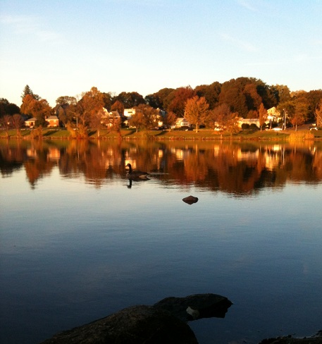
It’s Wanderlust Wednesday, and this week we are returning to Wakefield, Mass to join the throngs of walkers circling the 3 mile path around the lake for their daily exercise. Like the swallows returning to Capistrano, with a hint of spring in the air, hundreds-no, thousands-of walkers/runners begin the migration back to the lake to shake off the winter layers (fleece and fat!) and start the annual pilgrimage to beach time fitness. While walking along, the scenery surrounding me constantly catches my eye, and each season brings a fresh new palette. In the fall, it was all about oranges and reds and yellows and golden sunsets.
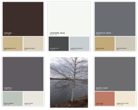
With the spring comes budding birch trees,

dormant greenery springing back to life,
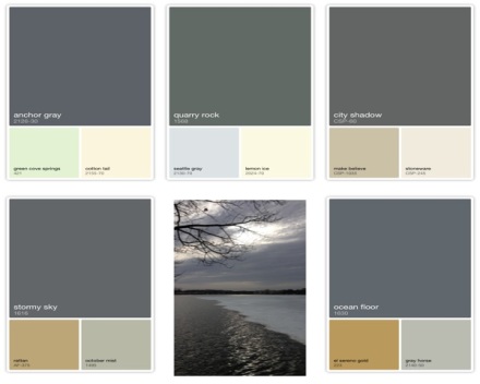
and melting ice floes with gray horizons.
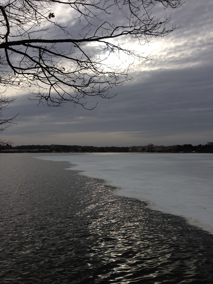
I have a new toy on my Iphone this season: Benjamin Moore Color Capture. You know when you see a house and you think “I wonder what color that is- I love it!” Would you ever put it past me to actually go knock on some perfect stranger’s door to ask what the color and paint brand their house was painted? Yup, done that! Now it’s a little simpler- I just snap a shot with my Iphone and the Color Capture Analyzer instantly produces all of their paint colors in that particular shot! Then you just go to the Benjamin Moore website, type in the color in the search box and there you have it-brilliant! So the melting ice and the dark sky over the open waters produced this palette in shades of grays with a purplish hue like Faded Violet and creamy whites from the cloudy sky called Chantilly Lace.
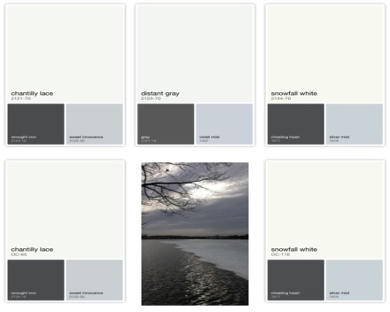
As you move the cursor around on the picture, it will pick up the subtle differences in the palettes- this one has more greens like Quarry Rock
The birch tree scene produced softer blues like Sweet Innocence, more whites and grays with hints of ambers and gold and a touch of coral from the ground cover that is still hidden under layers of mud and dirt.
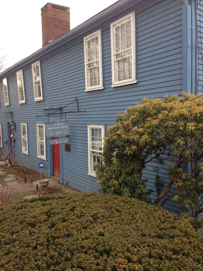
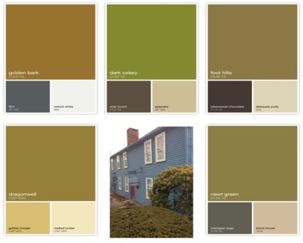
The Colonel James Hartshorne House , built in 1681, sits on the corner of the lake by the ball field. It is one that I have always admired, and recently they painted it this gorgeous blue-which color blue, you ask? Well, according to the palette, the closest is Bachelor Blue. But the lighting and time of day changes the hue, so best make sure you take several shots to get the perfect match!
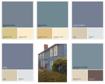
Even on the grayest, cloudiest day it still stands bright. And what blue house isn’t complete without a cheery red door? The color of this one? I’m going with the sexy, spicy Caliente.
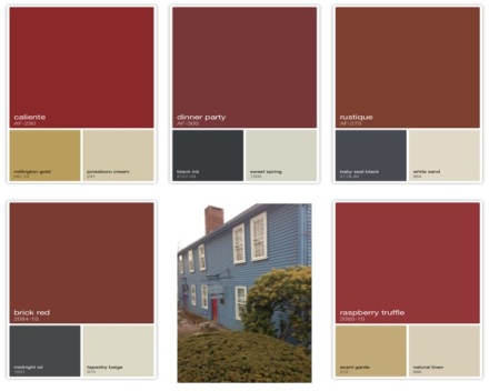 While I love that red door, which creates its own color palette, my eye was also drawn to the bright green shrubbery in the front that creates a stunning contrast to the rich blue. Dark Celery-the color in the budding shrub tips-is a great contrast to the blues and reds.
As great as that color scheme is for the Hartshore House exterior, wouldn’t it be great for interior space as well? I created this room on the Benjamin Moore Personal Color Viewer. You know all those colors you just captured outside? Go to the website and you can use them in all types of rooms- using their galleries or your own pics! For this one I used the colors from the lake and house photos: Quarry Rock, Bachelor Blue, Caliente and Chantilly Lace– the possibilites are endless!

Just make sure that when you are choosing your exerior colors, like the ones on the Hartshore House, you factor in the landscape and background- whether its the sky or water or the surrounding greenery, they all play a part in your palette! Hope you capture a Wanderful Wednesday everyone! Susan


Susan, apps like these not only make our work as designers faster and easier, it also makes it easier to explain to clients how colors flow together. Choosing colors for interiors and exteriors can be overwhelming to homeowners. Fear of color, particularly the fear of the wrong color, can stall a project and cost in time and materials. Being able to visualize colors can give the homeowner the confidence in making a better informed decision.
LikeLike
Absolutely! When you see a color you love, especially outdoors, it sometimes does not translate into an acutual paint color. With the app, you can see the true color, plus the accent colors-perfect!
LikeLike